
Interior Color Portfolio
My signature style includes dreamy tinted neutrals, saturated color focal points, bold contemporary pattern, delightfully curvy shapes, and elements of the natural world. As a designer I also know how to hone in on a client's unique needs and find the solutions that work for them. Do you desire a space with layers of gorgeous neutrals? I'll help you find the right neutrals for your space, as well as the textures to make it come alive. Is your style more edgy or more traditional? Having been a designer for over 25 years, I know how to create solutions for anyone. Most of all, I want to hear how you want to feel in a space, and together we can figure out how color can help get you there.
Ready to learn more? Write to me at kristin@woonwinkelhome.com. I look forward to hearing from you.
Gently Uplifting

photo by Heather V. Keeling
To refresh this 100-year-old breakfast nook, we looked for inspiration just outside the windows. Surrounded by new spring growth, we decided to harness the wonderfully balanced quality of green, which tends to be both energizing and calming. The pale greenish yellow of the walls creates a gentle backdrop while the contrasts in the fabric and art add energy. The dark blue door creates a focal point from the adjacent dining room, turning a bland sightline into an invitation to see what's up in the kitchen.

photo by Heather V. Keeling
We kept the walls, cabinets, and trim all one color for a modern look. Reducing the amount of contrast in this way also creates a more soothing space because your eyes and brain have fewer edges to discern. We chose to subtly highlight the archway with a dusty lilac, a fun quirk for this color-lover.
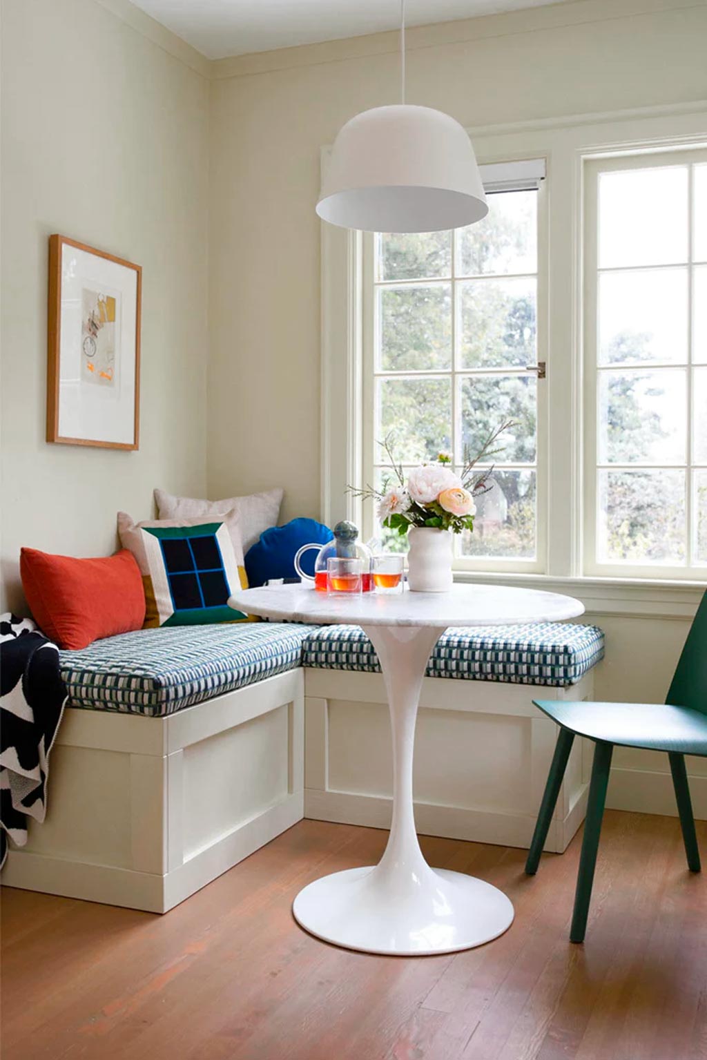
photo by Heather V. Keeling
Plenty of energy and contrast was added in through accessories and art sourced at my shop, Woonwinkel (pendant, chair, cushions, vase, and throw), Schoolhouse (blue cushion), and Rebecca Atwood (bench fabric). Black, white, and rust added complementary pep to an otherwise harmonious scheme.
Slender House - A Collaboration with Wendy Scott Design

photo by Heather V. Keeling
The Slender House is an award-winning structure by Waechter Architecture that Wendy Scott Design renovated and redecorated, and presented as one of six homes on the 2023 Portland Modern Home Tour. When Wendy started brainstorming with this client and it became clear that she was into COLOR, she called me in for collaboration. We formulated a color palette for the house that was broad enough to create different moods in different areas, while also creating cohesion for this multi-story home. Additionally, the palette needed to come together in two commissioned murals by Racheal Jackson of Banyan Bridges.

photo by Heather V. Keeling
We started with two nature images given to us by the client for inspiration. A dark forest scene prompted this rich, deep color for the living room, and it was planned to work with her existing sofa and coffee table, as well as the wood trim throughout the house. We pulled in bright accents of rust, orange, lilac, blush, and off-white to create energizing contrasts. These colors repeat throughout the house.

photo by Heather V. Keeling
The wall color is Miller Paint’s Lagoon Lullaby | R078 -- a perfect dreamy dark blue for a restful space. It's at its best when the light is low—it’s deep and cozy. We used eggshell finish for this dark color to play up the depth, and avoid glares from lights. We added layers of dark color, gloss and bold pattern to keep the dark scheme from becoming dull.

photo by Heather V. Keeling
We pulled dark color around the corner into the kitchen, but kept it confined to this bar area so the kitchen would still function well as a light-filled space.

photo by Heather V. Keeling
The rest of the kitchen stayed light, and was dramatically energized by this dimensional, artisan marble tile by Pratt and Larson chosen by Wendy Scott Design and the client. In this view you can see several items from my shop, Woonwinkel: the Up Step Stool, the Spruce Planter, the Serving Friends Board, the Cloud and Sun Print, the Craft Salt and Pepper Mills, the Ceramic Basket, the Simple Waffle Towel, and the Stacking Planter.

photo by Heather V. Keeling
The bedroom palette came from another nature image provided by the client. It was a vivid coastal scene, with deep blue waters contrasted by orange-red Indian Paintbrush flowers. We embraced that energetic and refreshing combination in the bedding and rug, and then softened it up a little to keep the space restful by using Miller Paint's Chickpea Please | R128. This is a color that you have to see in person, in real paint before you can truly appreciate it. I was grateful for the client's willingness to test it out; we were both so pleased with the final result. This open-plan space required careful consideration of where to start and end the color.

photo by Heather V. Keeling
The colors throughout the house came together beautifully in the two murals created by Racheal Jackson of Banyan Bridges. We collaborated with Racheal on the final palette for the murals since an artist knows best how much contrast and dimension she's going to need for a particular design. It took a little bit of real-time trial and error--a natural part of her process--to get the final palette just right. She nailed it.

photo by Heather V. Keeling
The guest bathroom got a flood of Miller Paint's Kind Kiss | R122. Right in between purple and pink, this greyed-down color is easy on the eyes. Painting the ceiling, trim and walls the same color creates a modern look, and also one that's cocooning. It works well in many kinds of spaces, but especially small ones because your eyes and brain don't feel as hemmed in by the edges.
Learn more about this project at Wendy Scott Design or Miller Paint.
Lush Contrasts

For this small entryway we took inspiration from the client's hot pink and white textile art from Mexico. To create an energizing moment after a hard day at work for this elementary school teacher, we went bold with a complementary deep green for the walls. Organic shapes repeat to create an impactful and cohesive vignette in this tiny space.
Funky Victorian Cottage

Entryways are great places to create a moment of impact. This small entryway got a huge uplift with restful blues you see when you come home, and energizing accents of pink and lilac that you see on your way out the door. A mirror with a shelf creates a landing spot for keys, the chair helps with putting on shoes. Dot Hooks create a charming constellation when coats are tucked away, and a Restore Basket gathers umbrellas, bats, balls and dog toys.
Weekend on Water - A Collaboration with Appetite Interiors

I joined forces with Appetite Interiors to curate a 3000sf showroom for an event that highlighted many of the home and design resources you can find in Portland's Central Eastside Design District. Pulling from shops like Cargo, Love Teak, Urbanite, Kabinett and more, we created several vignettes with powerful color statements.


Dreamy Pastels

Punchy Pops
Blue and Bold


A lighter, brighter bed area keeps things cheerful.